I received this question from a client the other day,* and I know it is a great design question that many people wonder about. Below is posted her question, and then, my thoughts on the matter:
{Lisa}:
I’m actually in the process of changing around our kitchen “theme”. I am going with a wine theme. Are themes stupid?? LOL. Like is that a big design no-no…to go with one theme or is it better to mix and match stuff for a more eclectic feel?
{darlene}:
Your question about themes is a great one!
My opinion? {keep in mind, design is all about opinions!}: I think it is better to think more broadly, and go with color schemes as opposed to decor themes. My reasoning is two fold:
- long term value
- real is better than faux
1. Long term value
If you fill your kitchen with wine-themed items, it will require an investment into items that you cannot use again once you are ready to redesign, or if you tire of your theme.
2. Real is better than faux
Usually, using a theme involves purchasing items that have your theme printed on them or painted on them. I, personally, think that this cheapens your decor.
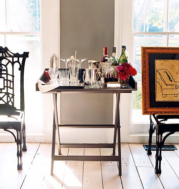
Instead, use your wine idea as Accent Pieces throughout, but not actually printed onto any fabric. Use REAL wine stuff… not pictures or images of wine stuff. How about using wine glasses, bottles, decanters, even beautiful bowls overflowing with grapes etc.?
For example, try to avoid buying a rug that has pictures of wine items on it… instead get a rug that ties into your color scheme.
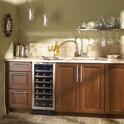
Decorate your counters with a line of beautiful wine bottles, a decanter, and a tray of gorgeous wine glasses. Make an effort to keep fresh grapes on display.
Then, if you cannot resist the itch, you could buy one sign that you love that declares your love for wine {try to avoid vines and painted wine glasses; just words} and hang it among real art {not prints! support your local artist and add class to your decor in the process} that depicts wine or grapes. You could also go with beautiful, framed photography of black and white wine glasses or bottles, or beautiful color photos of the tuscan landscape.
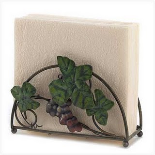
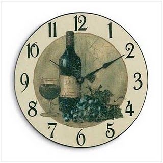
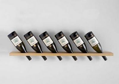
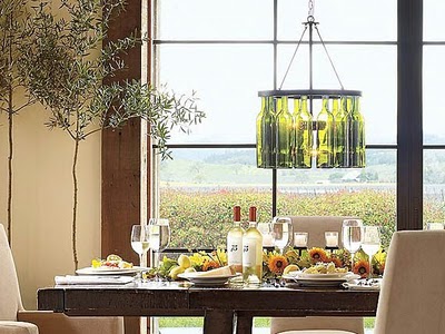
here are examples of what I would call faux decor:
What do you think? To theme or not to theme?
* * * * * * * *
The FHD February Giveaway has begun! You can enter at ANY time this month. Click here to enter, or click on the photo below to get to the Giveaway Page.
* * * * * * * * *
*{this is a repost from the FHD archives}



I 100% agree with this assessment. Doing a faux-theme seems cheap and is easily out-dated and can be expensive to re-do in a few years when you want a change. It’s all about the “feel” more than the visual images when it comes to creating a “theme”. Good job explaining it. 🙂
I agree with your assessment of theme rooms. If an object has a purpose, it qualifies to be in the room. Too many other items used just because they are a particular color or have a certain picture on them, become overkill and the room begins to look like a theme park. Less is more, in my opinion, when it comes to theme rooms. You can give the room a certain flavor with less rather than more.
Great post Darlene! I agree, no faux. I think it makes your space look cluttered , if that makes sense. Anyway, off to finish trimming out my bookcase! Have a great Saturday 🙂
I think themes help give people confidence and direction, but I totally agree with everything you’ve said.
In some ways, being locked into one particular design style kind of feels like a theme sometimes, too. I’m struggling to break out of a Paris/shabby chic “theme” in my kitchen.
Agree Darlene. It makes me cringe to walk into a home that has a room fulled with frogs, or mushrooms, etc. Sorry to the collectors out there.
Yes set out a lovely tray with gorgeous wine stemsware, an assortment of wine and perhaps an unusual wine opener.
xoxo
Karena
Art by Karena
I like Hobby Lobby, but I don’t want my home to look like Hobby Lobby.
‘Nuff said.
😉
Thanks for putting this into words! Very helpful!
Love your philosophy. I couldn’t agree with you more. I also try to make everyday things beautiful instead of hiding them and then purchasing things to “decorate” with.
Thanks for posting this! We’re expecting a baby and one of the first questions people ask is, “Are you doing a theme?” Even all of the baby bedding options are so theme-oriented.
We sort of fell into the habit of *curating* our home, rather than decorating. There are certain elements we just like–but they can be used in just about any room, swapped around, etc, because we like each individual item on its own, too. I do tend to put food-based art on the walls in the kitchen, though, or herb/botanical framed prints. It’s not a theme in there, but pieces I could use anywhere else, and just happen to have in the kitchen right now, because the beetle and moth shadowbox feels ooky for kitchen decor. 🙂
I think your post is spot-on! The “faux” decor items can look tacky, as can most themes. One place I think themes are fun, however, is in second homes or cabins. Most of northern Minnesota lakes are surrounded by little cabins that are decorated in bears, moose, pine trees, plaid, and lots of natural wood. The kitsch, in that case, is part of what makes it cozy and a little world away from the norm. But I would never have all those things in my everyday home! 🙂
Yes yes yes. Amen and amen. That’s why it’s so hard to find beautiful crib bedding: every manufacturer thinks the rooms must be themed.
…the only themes i like are the ones i use to make my students write…blessings…laney (well… to be honest…sometimes i did not like those either)
Wonderful post and spot on. I recently went with my mother to visit an old friend of hers and the ladies house was decorated top to bottom in 90’s southwestern. The house had beautiful bones that were lost in an array of indian blankets,cow horns, mauve walls and blue carpet.
I love your point about losing the “beautiful bones” of a home in a sea of themey overdose!
What a very well executed response. I totally agree with the way you answered this question. While I think color themes are fun, or a hint of a favorite character used in an unexpected way can be very whimsical in a child’s room. Using the full set of safari theme “from the box” doesn’t usually (probably never) work. Great Job!
well said!!! I am so bookmarking this for future clients. I love the way you explained it.
[…] buy the books and magazines it would have been an additional $100.00. A dear friend, Darlene at Fieldstone Hill Design, posted some important reminders when creating a theme that saved me from turning this […]
I am going beachy in my living room. I started by painting the walls sea salt by sherwin williams and buying a piece of coral from z galleries. I also hung gauzy white curtains. Was considering the faux turtle shell from the Nate Berkus collection at Target. Now, I will rethink that.
Julie! I definitely think that “beachy” can be done well. Like this room from my post today: http://www.fieldstonehilldesign.com/2012/10/ditto-a-cool-toned-living-room.html.
The beach theme is great because there are no images of what it would be like to be at the beach, there are simply things that you would actually find at a beach.
Also, it is balanced by other sophisticated and non-beach items. Like velvet!
Balance is key! And don’t buy items just because they are supposedly beachy. Buy them because you like them. If you were not thinking “beach” would you ever buy gauzy curtains? If the answer is no, then you are doing it just for the theme! Hope that helps!!!!
Thanks Darlene,
I’ve been dreaming of a velvet sofa for a couple of years now. I’m going to start looking and tell my husband, “Darlene told me to.” Hee Hee
fhd press:
FHD’s popular posts
sponsors I love
peruse
shop like it’s your job
FHD in blogland
categories
31 Days of Favorite Spaces A room I love about me Affordable Designer Rooms beautiful colors beautiful thoughts Bebe bebe bebe nursery before and after BHG blogland built-in of the Week client spaces contrast decorating yourself defining your style design boards design in progress design question ditto ditto d.i.y. ditto-worthy designers en masse farmhouse simplicity five faves for a song from my files here at Fieldstone Hill hiding the uglies high-gloss glamour Home tour Images Of inspiration Inspired to lessons in design living with beauty Living with Beauty: Beauty Tips and Tricks Living with Beauty: Wellness Living with Beauty: Whole Food Eating Living with Beauty: Within Master Designer mixed metals must have objects organizing overcome decorating paralysis project project kitchen project library project nursery punch color renovation rituals room by room sponsor style notebook traditions trends Uncategorized vision
Archives
Theme by Design by Kendall