inspiration :: blog design
Tuesday, August 30, 2011 by {darlene}

Fieldstone Hill Design got a new blog outfit! So. much. fun.

and, I am so thrilled about how it turned out.

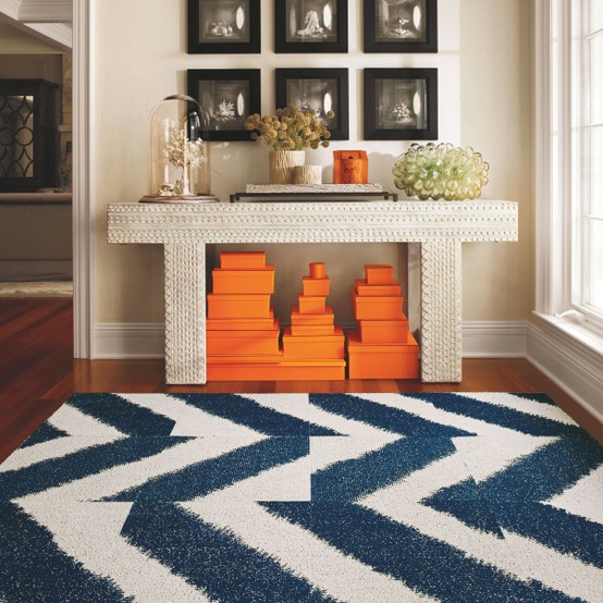
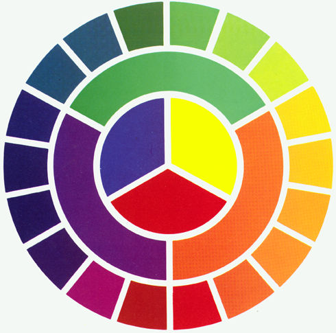
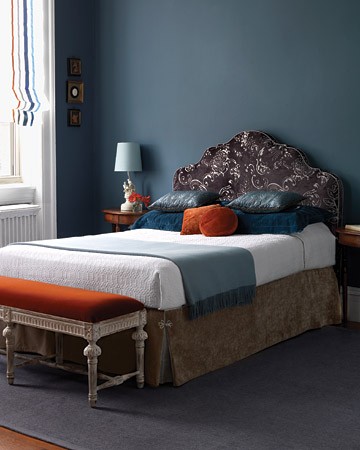
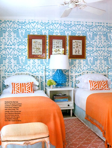
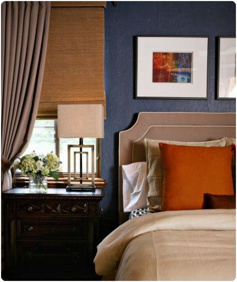
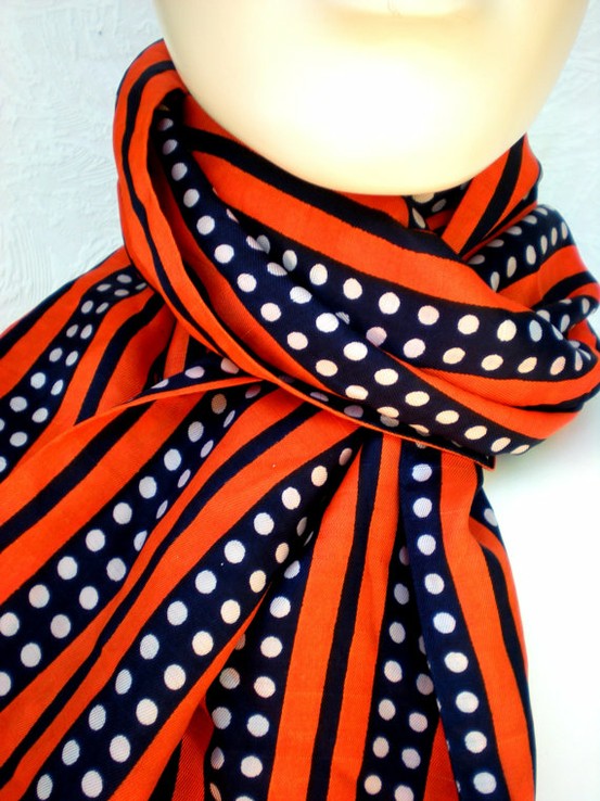
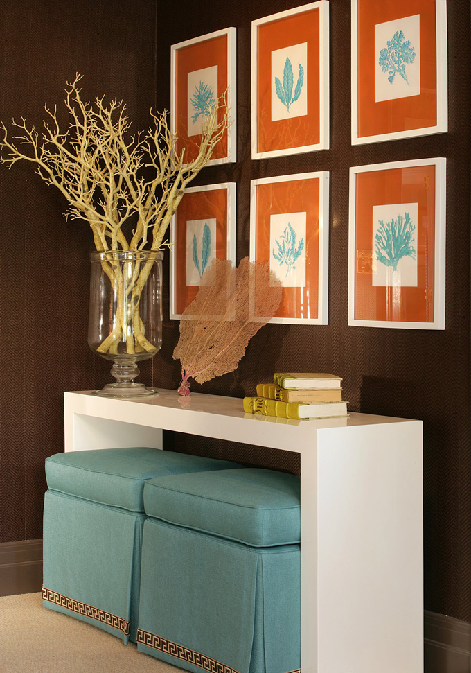
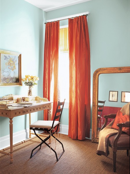
It was not hard to find blog inspiration… from decorating, of course!


Notice any of these decor elements reflected in my blog design?????

Now. Ask me to create a room based on all this inspiration, and I feel right at home.

…but turning all of that inspiration into a technical, beautiful blog design? Thank goodness for Kendall! {here is the part where, if you are itching to do a professional site redesign, I am going to tell you where to go! :)}

I mean, just look at this cute virtual-Kendall. You can just tell she has good taste:

Now, bless Kendall’s heart; Designing for a Designer has to be the crappiest job on earth. But she handled all of my tweaks, and re-tweaks, and re-re-tweaks with ease. It was important to her that I loved everything about my design! And she definitely went the extra mile to create a web design that I love!

I gave Kendall a zillion of my own ideas {such as the interior inspiration photos above}, which she creatively incorporated into my design. She helped me bring my F.H. logo design to life in the perfect way. And she reworked my ideas into useable, professional concepts.

And then she threw me the most beautiful, creative curveball with that gorgeous sunburst that you see in the upper left corner of my header. I can’t get over it. I’m still not over it. I just love it.

Well, now. If you are itching for a blog redesign, or if you want to make your site more professional, I recommend miss Kendall. Click here to see information on her Website Designing, and here for information on her Blog Designing. Go tell her I sent you 🙂

Now, I am itching to know what you think of the new design that we created!! Do tell, friends!

And if you don’t usually comment, you may find it easier to comment with WordPress commenting. I would love it if you said Hi!

Labeled: blogland, inspiration | 21 Comments
ditto :: an Autumn-inspired space
Monday, August 29, 2011 by {darlene}


What better way to start the week than with good news!

  1. we survived Irene! The families that are still suffering from the aftermath of this storm are in our prayers.
  2. and Fieldstone Hill Design has a new bloggy outfit! I can’t wait to tell you all about my blog design, and the designer, DesignbyKendall. So check back tomorrow, and I will share the details of how we worked together to create this design.
  3. I have switched to WordPress, which as a design-happy-gal, I am excited about. As a techie-deficient-gal who learns everything by watching YouTube tutorials… please give me grace as I stumble through this new blog platform! thanks, dears!

And what better way to ease into a Monday

than with a ditto?

This room hints at the gorgeousness of Autumn-to-come. And I must say, I love SO much about this room. Perfect for ditto-ing!

Feast your eyes on this beautiful space by Gwen Driscoll:

ditto :: {what I would steal from this space}:

  1. olive silk velvet. I die!! Remember my little tip about velvet? If you select cotton velvet or silk velvet over polyester velvet {you usually have to hunt to discover that it is, in fact, polyester or rayon or fake, etc.}, you will be astounded at how much more lovely your velvet fabrics will be. If you are going to go velvet, you may as well go with gorgeous velvet!
  2. orange leather. I die!! Again!! Have I mentioned how much I love orange? And add leather? Goodness gracious. This combination is heavenly. I will be ditto-ing some orange leather into my home at some point in my life! Are you ready to move in yet?
  3. deep gray-brown glossy walls. I am completely in love with lacquered walls lately. {Miles Redd is an amazing interior decorator who famously plays with the lacquered-paint look.} In this room, however, I am not convinced that the walls are lacquered. Instead, I think that they are high-gloss. In any case, you know how I love me some high-gloss glamour!
  4. deep gray-brown glossy walls. I am completely in love with lacquered walls lately. {Miles Redd is an amazing interior decorator who famously plays with the lacquered-paint look.} In this room, however, I am not convinced that the walls are lacquered. Instead, I think that they are high-gloss. In any case, you know how I love me some high-gloss glamour!
  5. x-benches. I love X-benches for several reasons: 1. they are not too large; 2. they are easy to move around the room; 3. they have an airy feel beneath them with the X-style legs, which helps a room to “breathe;” and 4. they are fully upholstered, which is the perfect excuse to use a new accent fabric in your space!
  6. real silver accessories. Add a touch of estate-loveliness to your space with a few choice touches of fine silver. Here, a lovely urn-vase and a simple tray do just nicely. And don’t fret about the polishing… life is short!
  7. lattice-back chairs. These simple chairs have a stunning shape. They add a great place to sit, but even more, their gorgeous lattice-backs add a touch of sculpture to the room. Place to sit, check. Add sculpture-art to room, check.
  8. a gallery wall with silhouettes. Gallery walls of family photos always add the perfect personal touch to a room. They are also so much fun to look at when you visit someone else’s home, are they not? But what I love most about this particular gallery wall are the two lovely silhouette portraits.
  9. trim that is painted to match the walls. I don’t usually employ this trick, but I love it in this space. Especially with the overall gloss feel that this room has! This trick will give a room the feeling of being more expansive and flowing.
  10. the autumn color scheme. This color scheme, with olives, browns, oranges, and deep grays has long been a favorite of mine. But it is ever so lovely this time of year. Time to turn our hearts inward and prepare the hearth for long nights with the family.

What would you “ditto” from this fantastic space?

this post is linked to Home Stories A to Z.

Labeled: ditto | 12 Comments
hurricane
Friday, August 26, 2011 by {darlene}

I wish I was talking about this:

……or even talking about this:

but, I am talking about this:

Continue Reading »

Labeled: blogland, here at Fieldstone Hill | 11 Comments
from my files :: complementary blue and orange
Friday, August 26, 2011 by {darlene}

I have been thinking a lot about contrasts lately, and how using them wisely and creatively can add such amazing beauty to a space.
my little obsession?:

  1. I posted a lesson in using contrasts in design, as part of my new “Lessons in Design” post collection.
  2. I have been gathering up a slew of Pinterest pics on my newest board: “my thing for contrasts.”
  3. And I have been keeping my eyes peeled for exquisite examples of contrast in Creation. {you should try this. you will be amazed at how many contrasts you find that create natural beauty!}

In collecting pictures, I have been just loving some of the spaces I have found that employ the color contrasts of blue and orange. Take this gorgeous space for example:

{also noteworthy are the contrasts of light and dark in this space as well}

This is not the first time I have posted about my love for this combination {see post here}. My grandma loved the combo of coral and navy, and she was sure to tell me that this color combination was both timeless and sophisticated. Yes, grandma!

If you take a look-sy at the color wheel below, you can draw a line straight across from the orange to the blue. For color-wheel newbies, that means that these colors are “complementary” or opposite. Complementary colors will provide you with the most contrast.

translation for us and our homes?? Complementary colors will provide you with the most drama.
{and I love drama.}
So, feast in the dramatic contrast of blue and orange. Maybe this gorgeous color combo is for you!:

{…pumpkin velvet makes my heart sing. just sayin’}

{…does this pic make you as happy as it makes me?}

{…symmetrical and color harmony!}

You can find the sources for all of these photos via my files at my Pinterest board, “my thing for contrasts.
Are you ready to use some contrasts in your home?
Is blue and orange for you?
Have you used this amazing color combination?
– {darlene}

To see my Design Boards, click here. To read more about my Design Services, click here. 
And thank you to everyone who is cheering me on in my dream of Fieldstone Hill Design. Love Fieldstone Hill? thanks. you rock. Would you consider sharing the love by Following {this makes me giddy. click Follow in the right sidebar}, Liking on Facebook, Following on Twitter, Following on Pinterest, or linking here from your blog. I just knew you were awesome!

Related Posts Plugin for WordPress, Blogger...

Labeled: beautiful colors, contrast | 6 Comments