{I just realized. It is not Monday. But it IS ditto day. Hope everyone enjoyed their Labor Day}
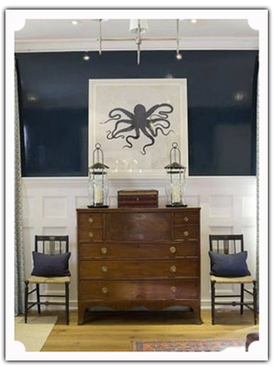
This picture has made its way around the web. But I really want to dissect it, and take a look at what makes this little vignette so appealing and gorgeous.
One thing that I noticed, as I began to break this space apart, is that it appears to be a segue way between two differently functioning spaces. For example, this could be shared wall space between a living room and dining room combination.
For clients {and even for myself, in my former home}, this type of a joint area can prove to be a design challenge. But this gorgeous space offers many thoughtful solutions, that are both beautiful and useful. {via Decor Pad}
DITTO :: {WHAT I WOULD STEAL FROM THIS SPACE}:
- a secretary in a segue way. A secretary is the perfect piece of furniture for a transitional area. First of all, it can work in nearly any kind of room, from a foyer to a bedroom to a dining room. Secondly, it is a very practical piece of furniture. Who could not use another writing surface in their home that also serves as a way to hide papers?? And lastly, the form of secretaries are stunning, and come in many different heights. All of these attributes make them the perfect choice for a blank strip of wall that is floating between two otherwise-defined spaces.
- two chairs flanking a secretary. Flanking the secretary with chairs brings a perfect touch of symmetry. And, a perfect place to sit.
- stunning symmetry. This space is so pleasing to the eye mostly due to the classic symmetry that brings shape and form to every angle. All of the symmetry focuses around the central, grand work of art. And from there, all you can see is symmetry, as though the space could be folded in half and line up perfectly.
- symmetrical pieces of varying heights. This “perfect” symmetry could be boring, but I adore all of the varying heights that are brought in. The persistent symmetry is made interesting with contrasting height pieces, such as the chairs against the secretary, the lanterns against the treasure box, and even the small drawers of the secretary verses the big drawers.
- deep, navy, lacquer walls. This navy wall is simply stunning. It definitely warrants a ditto to anyone with some guts for glamour.
- gutsy mixed with classic. You know how I feel about contrasts! And this space perfectly summarizes my own balancing act between farmhouse simplicity and high-gloss glamour. How beautifully these two ideas work together!!
- an uncommon piece of art that takes center stage. A grand octopus takes center stage, and this animal, typically not known for her beauty, becomes a work of art. Creation still remains the best subject for art, and easily steals the show. This octopus reminds me of the lovely bird from this ditto post.
- matching lanterns. These are particularly stunning due to their height. Flanking a piece of furniture with lamps is a more obvious choice, but I love the idea of using candle lanterns instead if extra lighting is not needed.
- gorgeous woodwork on the walls. This custom woodwork is stunning. And painted a crisp white, it provides the most amazing contrast which sets off the navy lacquer walls stunningly.
- navy pillows that tie into the wall color. A perfect, simple touch that adds just another classic touch of navy.
- bringing light into a segue way. I love that there is a grand chandelier in this small space. In my opinion, most homes don’t have enough light fixtures, and it is almost always a good choice to add more lighting. Why not add a stunning light fixture to a transition place such as this one?
This spot is so pleasing to the eyes, and there is so much to learn from and ditto! What would you ditto??


